
Monday, 15 December 2014

Tuesday, 9 December 2014
Monday, 1 December 2014
Monday, 24 November 2014
School Magazine Evaluation
Over all I felt my magzine went well for a first attempt. I was pleased with the end result but there are many areas for improvement. I feel that my main image and masthead were strong points and worked well on the cover. My layout and design was clear but there was a lot of dead space were I could have put some subsidiary images to make it more interesting. My content was minimal and was as good as it could have been. The cell lines could have been more interesting and there could have been more variation with the fonts and colours used. I like the footer line but it could have been more interesting to look at. The colours for the pug I think worked well and grabbed people's attention. If I was to do it again I would have definitely changed what my model was wearing for the photo. I felt it didn't link to school enough and the pink t-shirt don't match the colour scheme I was using. When I take my picture for my music magazine I will make sure that the clothing matches the look I will be creating for my magazine.
Friday, 7 November 2014
Creating my magazine.
 |
| 1st Draft |
When I started to look at creating my masterhead I decided that using key board keys for the title wouldnt be clear enough or bold enough to use as the main title for the cover. I decided that going with a type front would make it a lot more concise. I went with the Blue and Black alternating as I felt they would be regonisable as colours associated with a school magazine.
My image was a picture of a student. I took the photo into photoshop and removed the background. this made a lot more suitable for the front cover. I used a mid shot as it showed more of her face and it was more clear that it was about her.
At this stage I added the banner line in blue to match the masterhaed so that the colour scheme tied in a lot better.
I felt that the the pink of the students t-shirt really added some colour to the cover and made it a lot happier and brighter.
 |
| 2nd Draft |
I also repositioned the image more to the right of the page to make a better space for the text. I then added my pug. Originally this was yellow but that looked far too bright for a pug and I changed to blue.
I then changed the shade of blue on the masterhead as I wanted the pug to be a shader of blue brighter than the text to make it more prominent on the page. I changed the shade of blue for the banner as I felt that the darker shade added more depth.
 |
| 3rd Draft |
To make it all look better I repositioned the image and the pug on the page. I made them slightly bigger and moved them over to the left a little. I then made the cover line of the main image a little more bigger to make it stand out more.
I then went in and added the rest of my text and repositioned my page again so it looked more like a magazine cover and then I was finished.
 |
| Final Magazine Front Cover |
Monday, 20 October 2014
School Magazine Covers
Draft designs for my school magazine.
Magazine 1
 This was my first design for my school magazine and after looking at both my designs I quickly realised that this was the one I wouldn't use.
 I decided to use the title #New Life as I felt for my masthead as it would be appealing to members of the school (particulary sixth from, which I'd be aiming at.) When joing sixth form we look at it as a new start and a chance to finally do what we've been waiting to do. There fore it feels like a new life. I added the '#' symbol as I'd want to get the magazine trending online and gain a bigger following. With so many people using the internet for so much these days, I felt it was important to add this in. I put the letters in boxes for my title so they would stand off the page better and make it more eye catching.
 My main image is big capital letters saying 'WE'. I woulf fill the letters with head shots of people of the school. Under neath that would be 'ARE THE FUTURE'. I wanted the main focus off the magazine to be different and show a bigger message. 'WE ARE THE FUTURE' would speak to sixth forms students because its what they are. It would grab the readers attention and make them want to read it. They would also relate to the pictures of the students as thats what they are.
I chose the line 'One world. One classroom' as I wanted to add a serious tone to the magainze. Being in sixth form you want to be treated like adults. The serious tone behind the message makes you think about how we all matter and the lack of explanation makes the reader more tempted to read on.
My pug is 'Be Creative'. I wanted ot to be snappy and short to read
so it wouldn't be boring. I choose be creative as alot of sixth form work is being creative and finding new and interesting ways to do things.
 My footer line at the bottom consists of short prhases. I choose them because they are topics that all sixth form students can relate to and are often looking for information for. they appeal to my audience and would make the reader want to know more.
I chose the cover line 'Computer is my school. Google is my teacher' as sixth form students can easily relate to it. It's how sixth form students feel a lot of the time as A level work is very independent and they have to figure things out for themselves.
I chose blue as my over all cololurs for things on my magazine as its a colour associated with school and therefore would be more regonised as a school magazine.
Although I liked this magazine idea, I felt it was to cluttered and perhaps a little too deep and political to work for a school magazine.
Magazine 2

 I used 'School Life' as my title for my magazine as I felt it was an appropriate and relateable title. It's trusting and inviting at the same time. I thought that making them keyboard keys would look good and have a better feel for a school magazine. However, getting the rest of the magazine to blend in with that could be difficult. I put the blue banner behind it so the title would stand out a lot more and your eyes would be drawn to it. I chose blue as a constant theme as its a friendly and a calm colour and is a colour that you would associate with a school magazine.
 The main imgae is a mid-shot of 3 sixth form students. I chose sixth form students as my main
audience will be sixth form. The caption for my image is 'We Are The Future'!'. I used this because I wanted to grab the readers attention by drawing them in with a phrase that has maening but as the same time quite vague which makes you want to know more.
My pug is 'NEW Uniform?' I left this as a question as it makes you want to know more and find out the answer. I chose this as new uniform would be a shock to sixth form students and the news of finding out would spread very quickly. Making the magzine more talked about.
I chose to have 2 pictures in a box at the bottom of the page to make the magzione more interesting and appeal to a wider range of people. 1 will be a picture of people in the drama derpartment and the other of people studying in the resource area. I felt these two topics would be appropriate for a school magazine.
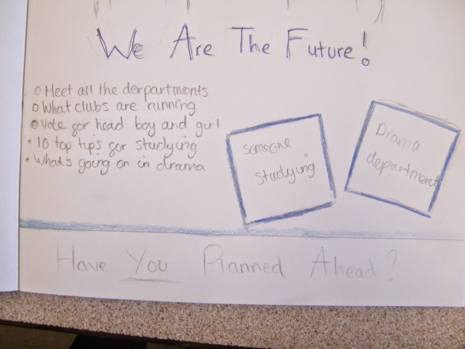 My footer line at the bottom of the page is 'Have YOU Planned Ahead?' I put the 'YOU' in capitals to make it seem more important and like the magazine was talking to you. Using direct adress makes the magazine seem more firendly.
My cover lines on the left of the page are put as bullet points to make them more snappy and clearer. The lines are all realated to school and appeal to a wide range of people. Having a topic for everyone makes the magazine more suitable for more people.
At this stage I haven't decided on a background. I like the idea of taking the photograph infront of a brick wall so the background has a natural feeling and like it belongs in a school magazine. Having brick buildings in this school means that people will relate to the image. I want to give off a school vibe from the image and bricks may be a step too far as someone against a brick wall often gives a bad impression. During the final designing stages I will have to look at the bricks as a background and see if it works.
I'm choosing to go with magazine cover 2 as I feel that over all it is more appropraite and inviting as a school magaizne.
Magazine 1
I decided to use the title #New Life as I felt for my masthead as it would be appealing to members of the school (particulary sixth from, which I'd be aiming at.) When joing sixth form we look at it as a new start and a chance to finally do what we've been waiting to do. There fore it feels like a new life. I added the '#' symbol as I'd want to get the magazine trending online and gain a bigger following. With so many people using the internet for so much these days, I felt it was important to add this in. I put the letters in boxes for my title so they would stand off the page better and make it more eye catching.My main image is big capital letters saying 'WE'. I woulf fill the letters with head shots of people of the school. Under neath that would be 'ARE THE FUTURE'. I wanted the main focus off the magazine to be different and show a bigger message. 'WE ARE THE FUTURE' would speak to sixth forms students because its what they are. It would grab the readers attention and make them want to read it. They would also relate to the pictures of the students as thats what they are. I chose the line 'One world. One classroom' as I wanted to add a serious tone to the magainze. Being in sixth form you want to be treated like adults. The serious tone behind the message makes you think about how we all matter and the lack of explanation makes the reader more tempted to read on.
My pug is 'Be Creative'. I wanted ot to be snappy and short to read
so it wouldn't be boring. I choose be creative as alot of sixth form work is being creative and finding new and interesting ways to do things.
My footer line at the bottom consists of short prhases. I choose them because they are topics that all sixth form students can relate to and are often looking for information for. they appeal to my audience and would make the reader want to know more. I chose the cover line 'Computer is my school. Google is my teacher' as sixth form students can easily relate to it. It's how sixth form students feel a lot of the time as A level work is very independent and they have to figure things out for themselves.
I chose blue as my over all cololurs for things on my magazine as its a colour associated with school and therefore would be more regonised as a school magazine.
Although I liked this magazine idea, I felt it was to cluttered and perhaps a little too deep and political to work for a school magazine.
Magazine 2
I used 'School Life' as my title for my magazine as I felt it was an appropriate and relateable title. It's trusting and inviting at the same time. I thought that making them keyboard keys would look good and have a better feel for a school magazine. However, getting the rest of the magazine to blend in with that could be difficult. I put the blue banner behind it so the title would stand out a lot more and your eyes would be drawn to it. I chose blue as a constant theme as its a friendly and a calm colour and is a colour that you would associate with a school magazine. The main imgae is a mid-shot of 3 sixth form students. I chose sixth form students as my main audience will be sixth form. The caption for my image is 'We Are The Future'!'. I used this because I wanted to grab the readers attention by drawing them in with a phrase that has maening but as the same time quite vague which makes you want to know more.
My pug is 'NEW Uniform?' I left this as a question as it makes you want to know more and find out the answer. I chose this as new uniform would be a shock to sixth form students and the news of finding out would spread very quickly. Making the magzine more talked about.
I chose to have 2 pictures in a box at the bottom of the page to make the magzione more interesting and appeal to a wider range of people. 1 will be a picture of people in the drama derpartment and the other of people studying in the resource area. I felt these two topics would be appropriate for a school magazine.
My footer line at the bottom of the page is 'Have YOU Planned Ahead?' I put the 'YOU' in capitals to make it seem more important and like the magazine was talking to you. Using direct adress makes the magazine seem more firendly. My cover lines on the left of the page are put as bullet points to make them more snappy and clearer. The lines are all realated to school and appeal to a wide range of people. Having a topic for everyone makes the magazine more suitable for more people.
At this stage I haven't decided on a background. I like the idea of taking the photograph infront of a brick wall so the background has a natural feeling and like it belongs in a school magazine. Having brick buildings in this school means that people will relate to the image. I want to give off a school vibe from the image and bricks may be a step too far as someone against a brick wall often gives a bad impression. During the final designing stages I will have to look at the bricks as a background and see if it works.
I'm choosing to go with magazine cover 2 as I feel that over all it is more appropraite and inviting as a school magaizne.
Subscribe to:
Comments (Atom)